Redesign & Tradeshow Package
Peachfork
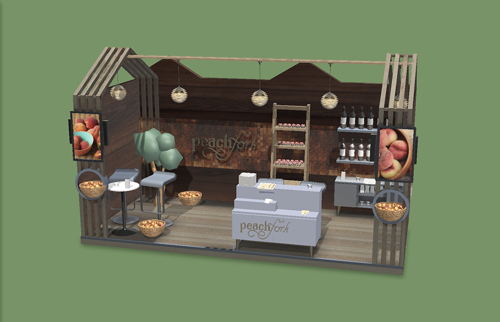
Peachfork is an orchard and winery with a need for a rebranding and tradeshow package. Expanding business can call for a redesign to help expand business toward bigger sellers. The tradeshow package includes a business card, sales sheet, takeaway item, eblast, and tradeshow booth design.
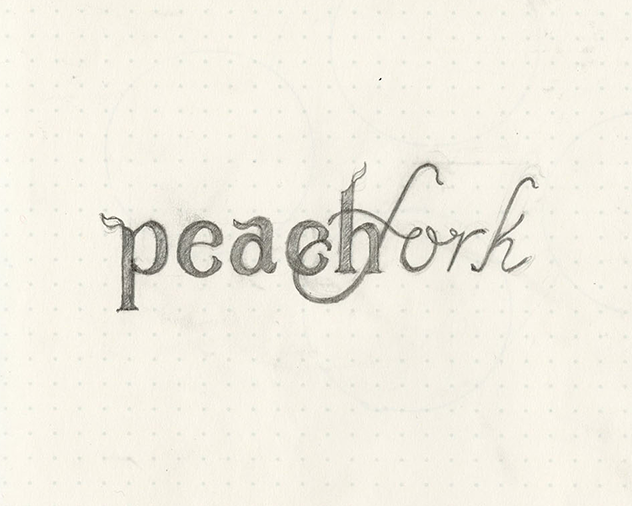
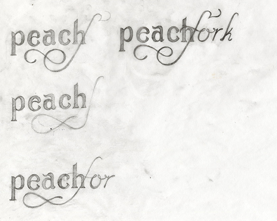
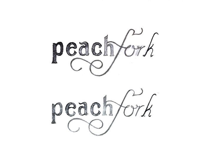
The first design of the Peachfork logotype established the lettering styles, but needed refinement for increased readability by adding more seperation between the two part of the word.
The serif type stood best alone without the unnecessary decorations and the decorated F in fork served to move the eye through the logo.
Print Items
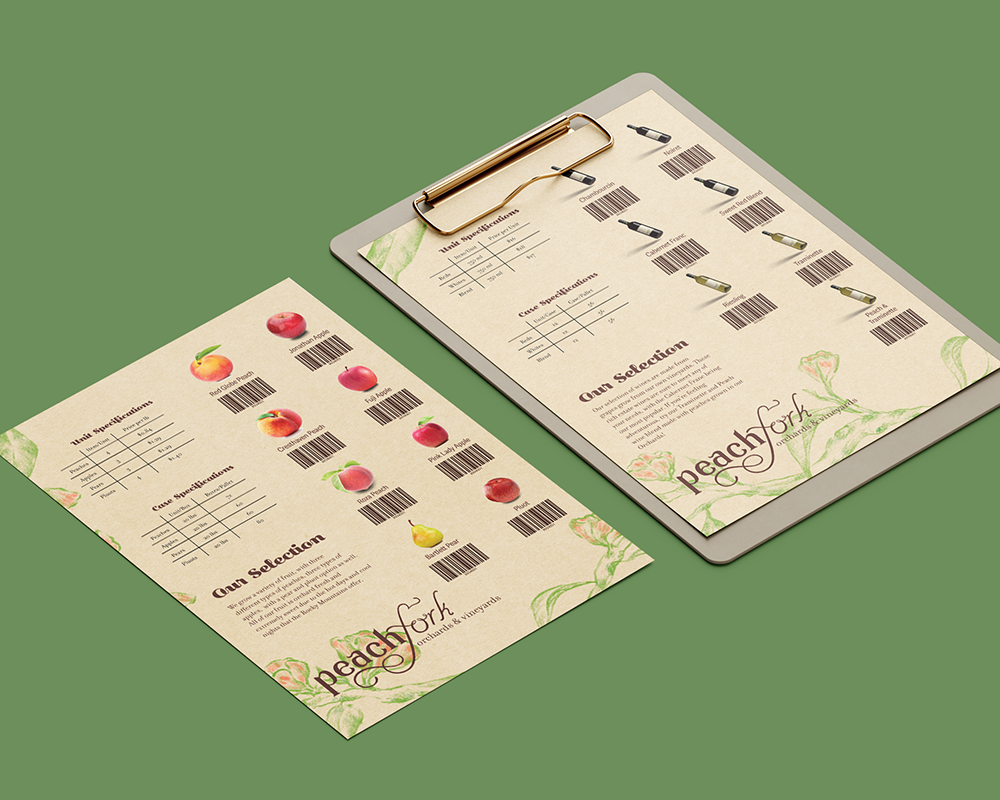
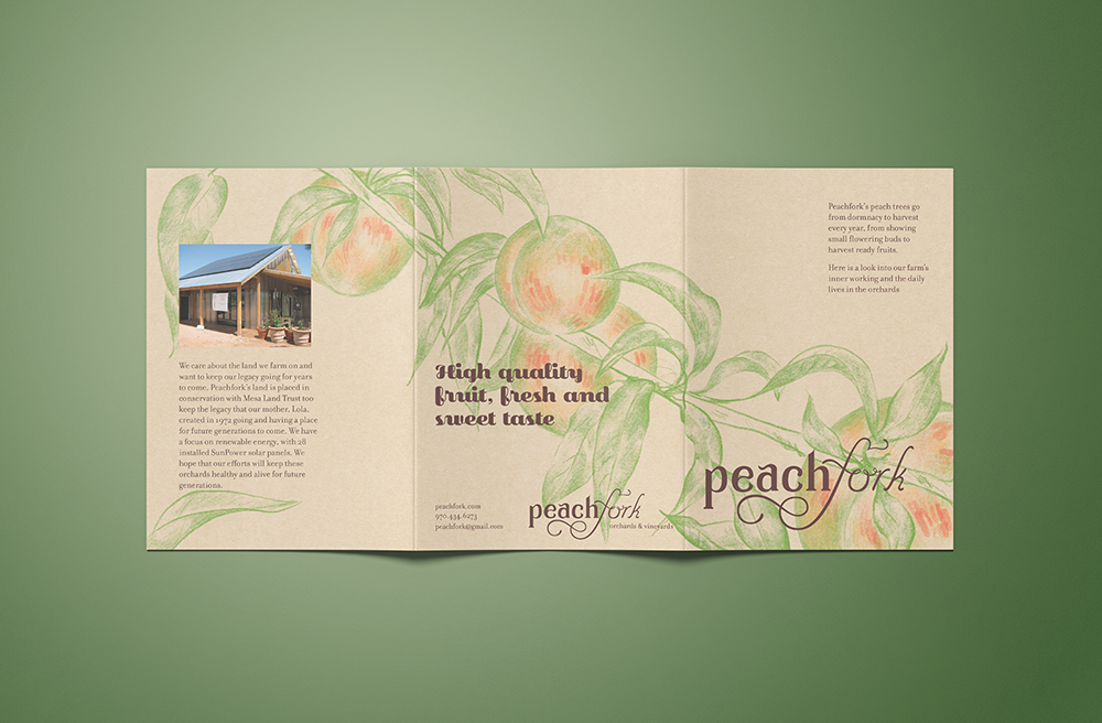
The sales sheet is meant to hand out to potential businesses that would be interested in selling Peachfork’s selection. It functions as a form to order as well as reminder of the brand once the event is over.
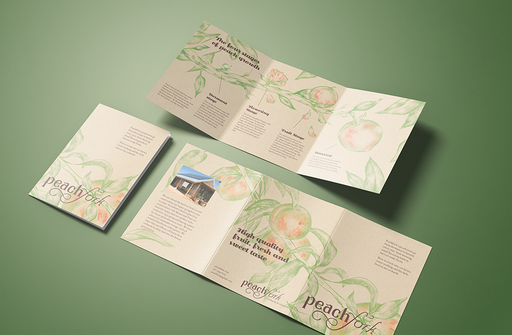
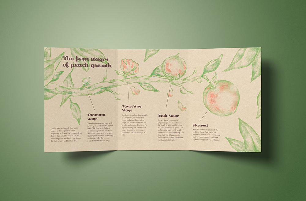
A takeaway featuring the stages of peach growth involves the audience in the process behind the peach harvest. Having a memorable print piece inspires recall in any event attendees, helping the brand stand out against competitors by creating a connection with the audience.
Business Card and Giveaways
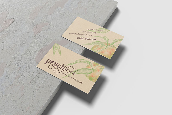
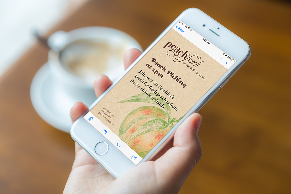
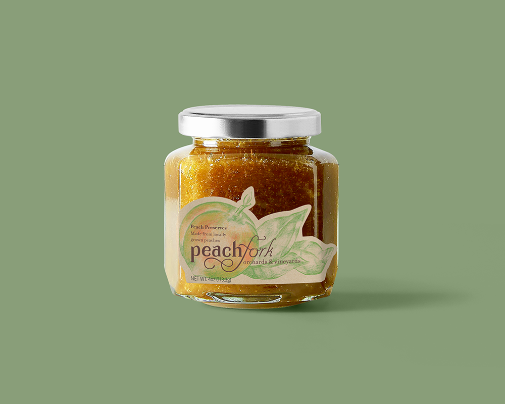
The business card is meant to create small connects and give a point of reference back to potential buyers. The eblast and good item are ways of driving traffic to the booth, giving a taste of Peachfork’s products and showcasing an event that gives people a chance to interact with representatives.
